My first design
Frontline organized our first concert on 31 August 2002. Our former supporting organization YMCA suggested to arrange a farewell party for us using the remaining budget. However we thought it would be better to spend that good deal of money to reach more people, so we organized a concert in the Crystal Room, International House of The Chinese YMCA of Hong Kong. Since the room can accommodate 240 people, we started off the concert in a small scale one. Moreover, the budget allowed us to hire professional audio system for the concert, so it turned out to be medium scale.
We started off by deciding the name of the concert. Apart from using terms like "farewell" & "goodbye" (which we didn't plan to retire that soon), we hoped to bring positive messages to the audience, even though we were still in uncertainty. Finally we chose to use the name of the song we recorded in 1998, theme song 創造前路 (meaning "heading to the future") written by Ronald Tang for YMCA 85th Anniversary. 《Frontline 創造前路音樂會》 is the simple and straight-forward name we came up with.
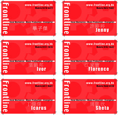
For the graphic design, I started by working on the concert ticket. Since we didn't plan to widely spread the concert news to every church in Hong Kong, we adopted a low-budget design scheme. Ticket size is fixed to one forth of A4 paper, printed in mono color, with auto number printed as ticket serial. The "group of gears" concept is the main element of the whole design plan. The cropped "Frontline" in the bottom suggests emerging from ground. It represents Frontline migrating to a new era, echoing the concept of our concert's name. The left portion is the ticket stub. I put a studio microphone's photo (Georg Neumnn GmbH M147 Tube) there, since we planned to start recording in one or two year's time. However, I hate the idea of putting a mic there. =D

Concert ticket
After designing the ticket, I contacted a printing company in Kwai Chung, and they helped me a lot in fixing technical issues like adding auto-number and cutting line. To play safe, I chose the color black for the ticket.
After submitting the electronic file to the printing company, I started working on the programme booklet. I played with a blank A4 paper, and tried different methods of folding it to be a booklet. To make it consistent with the ticket, I chose to retain the dimension of the rectangle shape, while enlarging the size into half of A4. I chose to fold along the long side at the center of the paper, while the open ends are at the bottom, folding up for the booklet's contents. The booklet is in mono color, and I chose the same pantone color as our name card. The design continued the concept of the ticket, "group of gears" with the word "Frontline" emerging from the bottom. I retained the Chinese words of the concert's name in the upper part, while adding details of time and venue just below. However I did amend one tiny thing in the design. I'll show to you later.

Booklet Outside front
Flipping over the front cover, you'll see the main content of the booklet, being the introductory passage of Frontline and sharing of individual singers. For the ticket and front cover, you can only see portion of the three gears. Now you can see three gears in a more complete picture after investigating them in depth, just like you need to put effort in knowing a group or person. Moreover I turned the character "L" of the word "Frontline" into path, adding contour to it from bottom to top. It provides continuity to the whole design, and suggests we're progressing on the road of music ministry. Such concept appears in the front cover too.
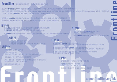
Booklet Inside
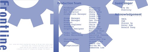
Turning to the back of the booklet, you'll see the backing of gears - our production credits, guest singers and acknowledgement. I decided to use typewriter's font Courier to create special atmosphere to it. I'd rather hide my intention here and let you have a guess. You may realize there're tiny little words at the left bottom region. In case you can't read it on screen, I quote here.
Booklet Outside back
You may wonder what is the whole picture of the booklet outside? Here it is. The graphical elements are basically the same as the booklet inside. I just changed the color into higher or lower saturation of color. From this view you can see the contour effect of letter "L" very sharp. It binds the whole design together.
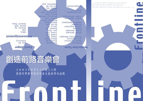
Booklet Outside
Just days before the concert, I worked on the "Thank You Card" for our production team, guest singers and VIPs. I chose a group photo taken after CAS2001 Summit concert. With the lens I added to the photo, the words pop up from the surface. Actually this act is rather subjective, and I guess some people dislike it because it can't show our real face. HA! You can treat this as the underlying reason of processing the photo. Moreover I framed the card in border-less glass photo frame from IKEA. As a result I added "photo frame border" around the photo, with "Frontline" pops out the border. This adds some liveliness to the whole design.
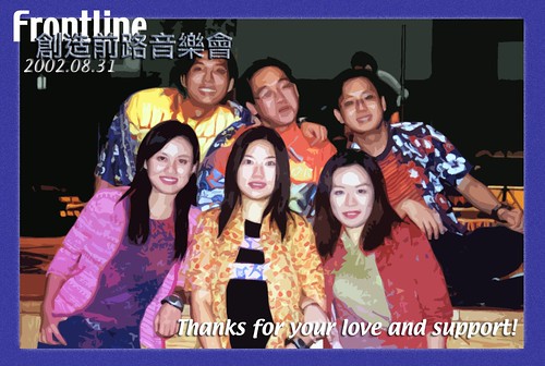
Thank You Card
Other than graphics design, I put some effort in the set design too. We fellows decorated the stage like a living room, bringing home-feel environment to the audience. It disclosed our relationship among singers and our coach Steven Ip too - though not talking to each other often, we're genuine supporters of each other. Most of the stuffs on stage are from my apartment, the blue sofa cover, cushions, photo frame, tissue boxes and table lamps. Actually you can say it's Sheta's living room. =P
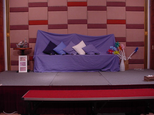
Set design - on stage
There was a piano corner just in front of stage, enlarging the stage down the platform towards the audience. I placed my favorite blanket on top of a round table, placing the Kurzweil MicroPiano on top of it, linking up with the Roland A-30 MIDI controller. The lamp on the round table provides sufficient light for the pianist in reading music scores. Other things are just decors, including my favorite cartoon character 剛 (Gon) and the "five loaves and two fishes" cross. Now you know more about me in observing all these tiny little things in the concert.
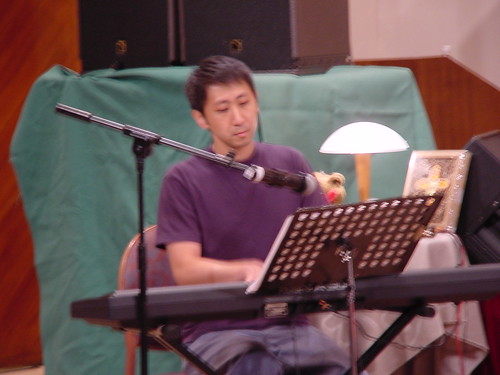
Set design - piano corner

Set design - round table of the piano corner
When the concert was over, there were quite a few audience stepping on stage, looking at the decors piece by piece, and even took photos with the set. I was so delighted.
We started off by deciding the name of the concert. Apart from using terms like "farewell" & "goodbye" (which we didn't plan to retire that soon), we hoped to bring positive messages to the audience, even though we were still in uncertainty. Finally we chose to use the name of the song we recorded in 1998, theme song 創造前路 (meaning "heading to the future") written by Ronald Tang for YMCA 85th Anniversary. 《Frontline 創造前路音樂會》 is the simple and straight-forward name we came up with.
For the graphic design, I started by working on the concert ticket. Since we didn't plan to widely spread the concert news to every church in Hong Kong, we adopted a low-budget design scheme. Ticket size is fixed to one forth of A4 paper, printed in mono color, with auto number printed as ticket serial. The "group of gears" concept is the main element of the whole design plan. The cropped "Frontline" in the bottom suggests emerging from ground. It represents Frontline migrating to a new era, echoing the concept of our concert's name. The left portion is the ticket stub. I put a studio microphone's photo (Georg Neumnn GmbH M147 Tube) there, since we planned to start recording in one or two year's time. However, I hate the idea of putting a mic there. =D
Concert ticket
After designing the ticket, I contacted a printing company in Kwai Chung, and they helped me a lot in fixing technical issues like adding auto-number and cutting line. To play safe, I chose the color black for the ticket.
After submitting the electronic file to the printing company, I started working on the programme booklet. I played with a blank A4 paper, and tried different methods of folding it to be a booklet. To make it consistent with the ticket, I chose to retain the dimension of the rectangle shape, while enlarging the size into half of A4. I chose to fold along the long side at the center of the paper, while the open ends are at the bottom, folding up for the booklet's contents. The booklet is in mono color, and I chose the same pantone color as our name card. The design continued the concept of the ticket, "group of gears" with the word "Frontline" emerging from the bottom. I retained the Chinese words of the concert's name in the upper part, while adding details of time and venue just below. However I did amend one tiny thing in the design. I'll show to you later.
Booklet Outside front
Flipping over the front cover, you'll see the main content of the booklet, being the introductory passage of Frontline and sharing of individual singers. For the ticket and front cover, you can only see portion of the three gears. Now you can see three gears in a more complete picture after investigating them in depth, just like you need to put effort in knowing a group or person. Moreover I turned the character "L" of the word "Frontline" into path, adding contour to it from bottom to top. It provides continuity to the whole design, and suggests we're progressing on the road of music ministry. Such concept appears in the front cover too.
Booklet Inside
Turning to the back of the booklet, you'll see the backing of gears - our production credits, guest singers and acknowledgement. I decided to use typewriter's font Courier to create special atmosphere to it. I'd rather hide my intention here and let you have a guess. You may realize there're tiny little words at the left bottom region. In case you can't read it on screen, I quote here.
Ivor, Jenny and others started this group in 93 and later others goneThat's the reason we sing!
but Icarus, But, Florence and Sheta joined in 96.
Since then we join together in Steven's home to make
a harmony project of singing the message from Heaven.
Booklet Outside back
You may wonder what is the whole picture of the booklet outside? Here it is. The graphical elements are basically the same as the booklet inside. I just changed the color into higher or lower saturation of color. From this view you can see the contour effect of letter "L" very sharp. It binds the whole design together.
Booklet Outside
Just days before the concert, I worked on the "Thank You Card" for our production team, guest singers and VIPs. I chose a group photo taken after CAS2001 Summit concert. With the lens I added to the photo, the words pop up from the surface. Actually this act is rather subjective, and I guess some people dislike it because it can't show our real face. HA! You can treat this as the underlying reason of processing the photo. Moreover I framed the card in border-less glass photo frame from IKEA. As a result I added "photo frame border" around the photo, with "Frontline" pops out the border. This adds some liveliness to the whole design.
Thank You Card
Other than graphics design, I put some effort in the set design too. We fellows decorated the stage like a living room, bringing home-feel environment to the audience. It disclosed our relationship among singers and our coach Steven Ip too - though not talking to each other often, we're genuine supporters of each other. Most of the stuffs on stage are from my apartment, the blue sofa cover, cushions, photo frame, tissue boxes and table lamps. Actually you can say it's Sheta's living room. =P
Set design - on stage
There was a piano corner just in front of stage, enlarging the stage down the platform towards the audience. I placed my favorite blanket on top of a round table, placing the Kurzweil MicroPiano on top of it, linking up with the Roland A-30 MIDI controller. The lamp on the round table provides sufficient light for the pianist in reading music scores. Other things are just decors, including my favorite cartoon character 剛 (Gon) and the "five loaves and two fishes" cross. Now you know more about me in observing all these tiny little things in the concert.
Set design - piano corner
Set design - round table of the piano corner
When the concert was over, there were quite a few audience stepping on stage, looking at the decors piece by piece, and even took photos with the set. I was so delighted.
posted by Sheta at 8:30 AM
0 comments
![]()
![]()